Heroes
Heroes are a primary focal point on landing and sublanding pages. They introduce a collection of pages by combining a brief description of the goals of that section along with a visually impactful graphic. To introduce lower-level pages, use the text introduction instead.
Types
Heroes combine a heading, a small amount of subheading text, and image. The content is vertically centered.
Hero with illustration
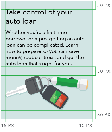
The illustration may be inset, as shown here, or bleeding. See examples of a hero with inset illustration and hero with bleeding illustration. Click on the “show details” link below for implementation details and production specs.
41 chars max for a one-line heading
This text has a recommended count of 165-186 characters (three lines at 1230px) following a one-line heading and 108-124 characters (two lines at 1230px) following a two-line heading.
HTML code snippet
<section class="m-hero" id="hero1">
    <div class="m-hero_wrapper wrapper">
        <div class="m-hero_text">
            <p class="h1 m-hero_heading">41 chars max for a one-line heading</p>
            <p class="m-hero_subhead">
                This text has a recommended count of 165-186 characters
                (three lines at 1230px) following a one-line heading
                and 108-124 characters (two lines at 1230px)
                following a two-line heading.
            </p>
        </div>
        <div class="m-hero_image-wrapper">
            <div class="m-hero_image"></div>
        </div>
    </div>
    <style>
         #hero1 .m-hero_wrapper {
           background-color: #d4e7e6;
         }
        #hero1 .m-hero_image {
            background-image:
                url('https://cfpb.github.io/design-system/images/uploads/hero_illustration_example_keys.png');
            background-image: -webkit-image-set(
                url('https://cfpb.github.io/design-system/images/uploads/hero_illustration_example_keys.png') 1x,
                url('https://cfpb.github.io/design-system/images/uploads/hero_illustration_example_keys.png') 2x
            );
            background-image: image-set(
                url('https://cfpb.github.io/design-system/images/uploads/hero_illustration_example_keys.png') 1x,
                url('https://cfpb.github.io/design-system/images/uploads/hero_illustration_example_keys.png') 2x
            );
            filter: progid:DXImageTransform.Microsoft.AlphaImageLoader(
                src='https://cfpb.github.io/design-system/images/uploads/hero_illustration_example_keys.png',
                sizingMethod='scale');
            padding-bottom: 41.4893617%;
        }
    </style>
</section>
Implementation details
Bleeding illustrations
When using an illustration that bleeds top to bottom at larger screen sizes, add the __bleeding modifier to the hero and add an additional m-hero_bleeding-image as a sibling to m-hero_image.
Customizing illustrations
The illustration can be customized by setting the background-image property on the .m-hero_image element.
Responsive behavior
On small screens (or where media queries are not supported), the text spans the full width of the .m-hero_wrapper and the illustration is displayed underneath.
For larger screen sizes, media queries are used to position the illustration to the right of the text.
At the grid’s maximum width and above, the hero should not exceed 285px in height. The image should be 195px in height to conform to this standard.
Specs
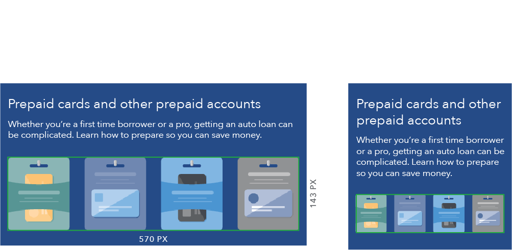
- Save illustrations at 200% to accommodate retina displays.
- Use a transparent background.
- Export illustrations as PNG files.
Standard hero with illustration
- Single image for both large and small screens
- Illustration dimensions: 470px (exact) x 195px (maximum) (2x: 940px x 390px)


Hero with bleeding illustration
- Two images must be created, one for large and one for small screens
- Large and small screen images should contain the same elements but can differ compositionally
- On large screens, illustration bleeds top and bottom
- Large screen image dimensions are based on maximum possible hero height at 601px width
- To conserve vertical space, small screen image should be as short as possible
- Illustration dimensions for large screens (exact): 470px x 638px (2x: 940px x 1276px)
- Illustration dimensions for small screens: 570px (exact) x 320px (maximum) (2x: 1140px x 640px)


Style at different breakpoints
| Item | Above 901 px | 601 - 900 px | Below 601 px |
|---|---|---|---|
| Heading | H1 | H2 | H2 |
| Subheading | Avenir Next Regular, 22px/28px | Avenir Next Regular, 18px/22px | Avenir Next Regular, 18px/22px |
| Padding | Top/bottom: 45px, left/right: 30px | All sides: 30px | Top/bottom: 30px, left/right: 15px |
| Text alignment | Vertically centered | Vertically centered | - |
| Height | 285px (fixed) | Module height is flexible to text height | Module height is flexible to text height |
| Image |  |
 |
 |
Hero with photograph
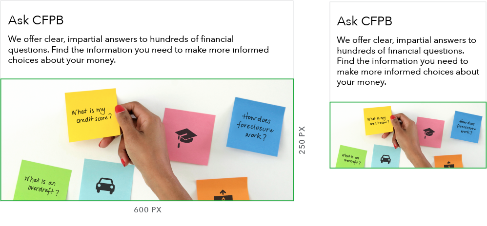
Note hero text overlays the photograph at larger screen sizes. See an example of a hero with photograph. For implementation details and production specs, click on the “Show details” link.
HTML code snippet
<section class="m-hero m-hero__overlay" id="hero4">
    <div class="m-hero_wrapper wrapper">
        <div class="m-hero_text">
            <p class="h1 m-hero_heading">41 chars max for a one-line heading</p>
            <p class="m-hero_subhead">
                This text has a recommended count of 165-186 characters
                (three lines at 1230px) following a one-line heading
                and 108-124 characters (two lines at 1230px)
                following a two-line heading.
            </p>
        </div>
        <div class="m-hero_image-wrapper">
            <div class="m-hero_image"></div>
        </div>
    </div>
    <style>
        #hero4 .m-hero_image {
            background-image:
                url('https://dummyimage.com/600x250/addc91/101820');
            background-image: -webkit-image-set(
                url('https://dummyimage.com/600x250/addc91/101820') 1x,
                url('https://dummyimage.com/1200x500/addc91/101820') 2x
            );
            background-image: image-set(
                url('https://dummyimage.com/600x250/addc91/101820') 1x,
                url('https://dummyimage.com/1200x500/addc91/101820') 2x
            );
            filter: progid:DXImageTransform.Microsoft.AlphaImageLoader(
                src='https://dummyimage.com/600x250/addc91/101820',
                sizingMethod='scale');
            padding-bottom: 41.6666667%;
        }

        @media screen and (min-width: 37.5625em) {
            #hero4 .m-hero_wrapper{
                background-image:
                    url('http://files.consumerfinance.gov/f/images/PC_hero.original.jpg');
                background-image: -webkit-image-set(
                    url('http://files.consumerfinance.gov/f/images/PC_hero.original.jpg') 1x,
                    url('http://files.consumerfinance.gov/f/images/PC_hero.original.jpg') 2x
                );
                background-image: image-set(
                    url('http://files.consumerfinance.gov/f/images/PC_hero.original.jpg') 1x,
                    url('http://files.consumerfinance.gov/f/images/PC_hero.original.jpg') 2x
                );
                filter: progid:DXImageTransform.Microsoft.AlphaImageLoader(
                    src='http://files.consumerfinance.gov/f/images/PC_hero.original.jpg',
                    sizingMethod='scale');
            }
        }
    </style>
</section>
Implementation details
It’s best to avoid a non-button call to action in these, as it’s unlikely that the Pacific Blue will have accessible contrast with a non-white (or light gray) background.
Specs
Hero with photograph
- Two images must be created, one for large and one for small screens.
- Large and small screen images should contain the same elements but can differ compositionally.
- When selecting a photo, include a 30px horizontal margin of clear space between text and image area.
- Type contrast ratios cannot be mathematically determined for photos, so special care should be paid when selecting these images.
- To conserve vertical space, small screen image should be as short as possible.
- Photo dimensions for large screens (exact): 1230px x 285px
- Photo dimensions for small screens: 600px (exact) x 338px (maximum)
- Export photos as PNG files.


Variations
Hero with knockout text
When using a dark background, add the __knockout modifier to the hero to switch the text to white. For reference, see this example of a hero with knockout text.
Max of 41 chars for a one-line heading
This text has a recommended count of 165-186 characters (three lines at 1230px) following a one-line heading and 108-124 characters (two lines at 1230px) following a two-line heading.
HTML code snippet
<section class="m-hero m-hero__knockout" id="hero2">
    <div class="m-hero_wrapper wrapper">
        <div class="m-hero_text">
            <p class="h1 m-hero_heading">Max of 41 chars for a one-line heading</p>
            <p class="m-hero_subhead">
                This text has a recommended count of 165-186 characters
                (three lines at 1230px) following a one-line heading
                and 108-124 characters (two lines at 1230px)
                following a two-line heading.
            </p>
        </div>
        <div class="m-hero_image-wrapper">
            <div class="m-hero_image"></div>
        </div>
    </div>
    <style>
        #hero2 {
            background-color: #207676;
        }

        #hero2 .m-hero_image {
            background-image:
                url('https://cfpb.github.io/design-system/images/uploads/design_system_hero_example.png');
            background-image: -webkit-image-set(
                url('https://cfpb.github.io/design-system/images/uploads/design_system_hero_example.png') 1x,
                url('https://cfpb.github.io/design-system/images/uploads/design_system_hero_example.png') 2x
            );
            background-image: image-set(
                url('https://cfpb.github.io/design-system/images/uploads/design_system_hero_example.png') 1x,
                url('https://cfpb.github.io/design-system/images/uploads/design_system_hero_example.png') 2x
            );
            filter: progid:DXImageTransform.Microsoft.AlphaImageLoader(
                src='https://cfpb.github.io/design-system/images/uploads/design_system_hero_example.png',
                sizingMethod='scale');
            padding-bottom: 41.4893617%;
        }

        @media screen and (min-width: 37.5625em) {
            #hero2 .m-hero_image {
                background-image:
                    url('https://cfpb.github.io/design-system/images/uploads/design_system_hero_example.png');
                background-image: -webkit-image-set(
                    url('https://cfpb.github.io/design-system/images/uploads/design_system_hero_example.png') 1x,
                    url('https://cfpb.github.io/design-system/images/uploads/design_system_hero_example.png') 2x
                );
                background-image: image-set(
                    url('https://cfpb.github.io/design-system/images/uploads/design_system_hero_example.png') 1x,
                    url('https://cfpb.github.io/design-system/images/uploads/design_system_hero_example.png') 2x
                );
                filter: progid:DXImageTransform.Microsoft.AlphaImageLoader(
                    src='https://cfpb.github.io/design-system/images/uploads/design_system_hero_example.png',
                    sizingMethod='scale');
                padding-bottom: 41.4893617%;
            }
        }
    </style>
</section>
Use cases
When to use
- When orienting a user to a new section or topic (using the landing or sublanding page template)
- When the page serves as a navigational tool with general information about a subject and links to lower-level pages that contain more specific information
When other options are better
- When introducing a specific piece of content, like a blog, press release, or other lengthy or detailed content, use the text introduction or item introduction.
Guidelines
Content guidelines
Hero content should orient the user and communicate the primary goal of the page. Copy should be succinct and engaging, reflecting the voice and tone of the CFPB.
Do
-
Write hero copy from the user’s perspective.
- Orient the user: “Is this page what I was looking for?”
- Engage the user: “Do I want to keep reading?”
Don’t
- Don’t write copy from the perspective of what the Bureau does or offers. It’s less about what we can do for them or what we can offer them, and more about what the user can do with the resources we provide.
- Don’t include links or calls to action within the hero. The goal of the hero is to get the user to continue reading the page, and calls to action detract from that. If there’s content that needs to link elsewhere for explanation, place it underneath the hero, within the main content area.
Headings
Communicate what the user can learn from the page or the benefit the page provides. Actionable, descriptive, orienting statements work best.
Headings should be a single phrase, preferably one line at the largest breakpoint. Take care to avoid orphaned text.
Headings should not include a period at the end. Question marks can be used when a question is asked, but avoid phrasing heroes as questions.
- One-line (at largest breakpoint): 41 characters maximum
- Two-line (at largest breakpoint): 82 characters maximum
Subheading content
Copy underneath the heading should be brief, enticing, and build upon the heading to describe the value of the page. Take care to avoid orphaned text.
- After one-line heading: Between 165 and 186 characters (three lines at largest breakpoint)
- After two-line heading: Between 108 and 124 characters (two lines at largest breakpoint)
Behavior
For style at different breakpoints, see specs for standard heroes.
| Above 600 px | Below 601 px |
|---|---|
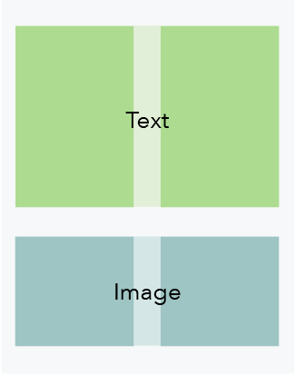
| Text and hero image appear side-by-side | Text and hero image stack vertically |
 |
 |