Expandables
Expandables are components that have additional content that can be opened (expanded) and closed (collapsed). They can appear on their own or in groups. They may be helpful for FAQ sections, schedules, and for conserving vertical space by collapsing secondary information on mobile devices.
Standard expandables
Standard expandable
The following combination is our recommended go-to expandable pattern.
HTML code snippet
<div class="o-expandable
            o-expandable__padded
            o-expandable__background
            o-expandable__border">
    <button class="o-expandable_header o-expandable_target"
            title="Expand content">
        <h3 class="h4 o-expandable_header-left o-expandable_label">
            Expandable Header
        </h3>
        <span class="o-expandable_header-right o-expandable_link">
            <span class="o-expandable_cue o-expandable_cue-open">
                <span class="u-visually-hidden-on-mobile">Show</span>
                {% include icons/plus-round.svg %}
            </span>
            <span class="o-expandable_cue o-expandable_cue-close">
                <span class="u-visually-hidden-on-mobile">Hide</span>
                {% include icons/minus-round.svg %}
            </span>
        </span>
    </button>
    <div class="o-expandable_content">
        <p>
            Lorem ipsum dolor sit amet, consectetur adipisicing
            elit. Neque ipsa voluptatibus soluta nobis unde quisquam
            temporibus magnam debitis quidem. Ducimus ratione
            corporis nesciunt earum vel est quaerat blanditiis
            dolore ipsa?
            <a href="#">Lorem link</a>.
        </p>
    </div>
</div>
Implementation details
A new array of Expandable instances can be created with const expandables = Expandable.init();. Each instance has the following methods for public consumption:
toggleTargetState( element )
const` element = document.querySelector( '.o-expandable_target' );
expandables[0].toggleTargetState( element );
Toggle an expandable to open or closed. Parameters:
- element {HTMLNode} The expandable target HTML DOM element.
getLabelText()
expandables[0].getLabelText();
Retrieve the label text of the expandable header. Return:
- {string} The text of the expandable’s label.
Specs
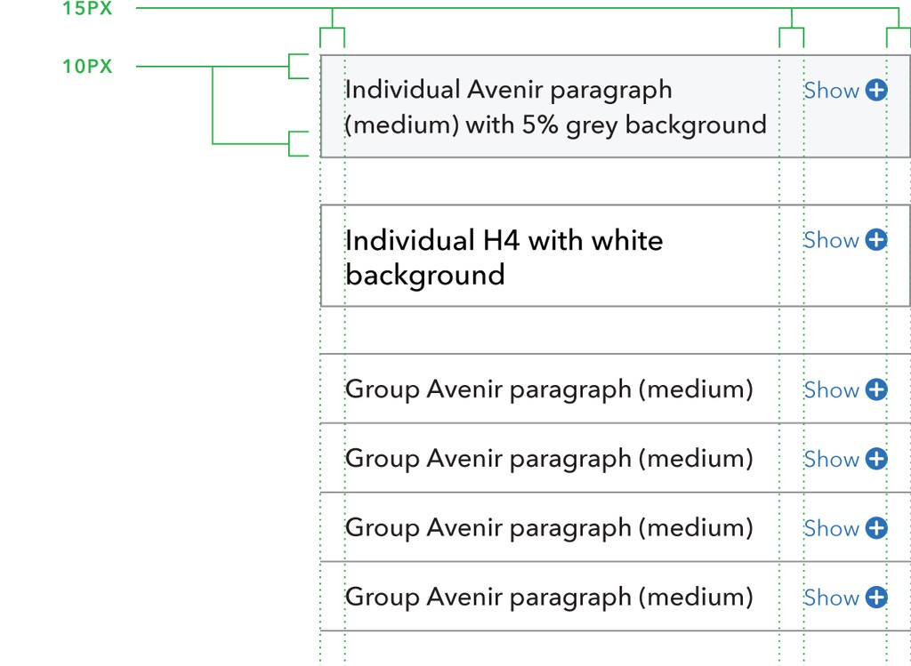
When only one expandable is used, it should include a stroke on all sides, heading text, and the expand/collapse minicon within a circle with a label reading “Show” or “Hide” (when possible). A white or 5% gray background can be used to highlight the section from the page background.
The entire bar is actionable. The header should clearly indicate what the user will see when the content is expanded (it should not be a call to action). Expand icons stay aligned at the top of the row when the title breaks to multiple lines.
Specifications
- 60% gray 1px strokes. All sides on individual, or top and bottom for grouping.
- Optional 5% gray or white background for individual expandable.
- 10px top and bottom padding.
- 15px left and right padding.
- 15px padding between title and minicon with label.
- Avenir paragraph (medium) or H4 title text.
- Pacific blue minicon and label.

Standard expandable (open on load)
Sometimes you may want the expandable to be open by default. This is as easy as adding the .o-expandable_content__onload-open modifier to the .o-expandable_content block.
HTML code snippet
<div class="o-expandable
            o-expandable__padded
            o-expandable__background
            o-expandable__border">
    <button class="o-expandable_header o-expandable_target"
            title="Expand content">
        <h3 class="h4 o-expandable_header-left o-expandable_label">
            Expandable Header
        </h3>
        <span class="o-expandable_header-right o-expandable_link">
            <span class="o-expandable_cue o-expandable_cue-open">
                <span class="u-visually-hidden-on-mobile">Show</span>
                {% include icons/plus-round.svg %}
            </span>
            <span class="o-expandable_cue o-expandable_cue-close">
                <span class="u-visually-hidden-on-mobile">Hide</span>
                {% include icons/minus-round.svg %}
            </span>
        </span>
    </button>
    <div class="o-expandable_content o-expandable_content__onload-open">
        <p>
            Lorem ipsum dolor sit amet, consectetur adipisicing
            elit. Neque ipsa voluptatibus soluta nobis unde quisquam
            temporibus magnam debitis quidem. Ducimus ratione
            corporis nesciunt earum vel est quaerat blanditiis
            dolore ipsa?
            <a href="#">Lorem link</a>.
        </p>
    </div>
</div>
Implementation details
A new array of Expandable instances can be created using a JavaScript API. For information, open the “Implementation” tab under Standard expandable.
Groups
Expandable group
In the default mode, users are able to have multiple sections of an expandable group expanded at the same time, which allows users to easily compare information that is available in different sections.
HTML code snippet
<div class="o-expandable-group">
    <div class="o-expandable o-expandable__padded">
        <button class="o-expandable_header o-expandable_target"
                title="Expand content">
            <h3 class="h4 o-expandable_header-left o-expandable_label">
                Expandable Header 1
            </h3>
            <span class="o-expandable_header-right o-expandable_link">
                <span class="o-expandable_cue o-expandable_cue-open">
                    <span class="u-visually-hidden-on-mobile">Show</span>
                    {% include icons/plus-round.svg %}
                </span>
                <span class="o-expandable_cue o-expandable_cue-close">
                    <span class="u-visually-hidden-on-mobile">Hide</span>
                    {% include icons/minus-round.svg %}
                </span>
            </span>
        </button>
        <div class="o-expandable_content">
            <p>
                Lorem ipsum dolor sit amet, consectetur adipisicing
                elit. Neque ipsa voluptatibus soluta nobis unde quisquam
                temporibus magnam debitis quidem. Ducimus ratione
                corporis nesciunt earum vel est quaerat blanditiis
                dolore ipsa?
                <a href="#">Lorem link</a>.
            </p>
        </div>
    </div>
    <div class="o-expandable o-expandable__padded">
        <button class="o-expandable_header o-expandable_target"
                title="Expand content">
            <h3 class="h4 o-expandable_header-left o-expandable_label">
                Expandable Header 2
            </h3>
            <span class="o-expandable_header-right o-expandable_link">
                <span class="o-expandable_cue o-expandable_cue-open">
                    <span class="u-visually-hidden-on-mobile">Show</span>
                    {% include icons/plus-round.svg %}
                </span>
                <span class="o-expandable_cue o-expandable_cue-close">
                    <span class="u-visually-hidden-on-mobile">Hide</span>
                    {% include icons/minus-round.svg %}
                </span>
            </span>
        </button>
        <div class="o-expandable_content">
            <p>
                Lorem ipsum dolor sit amet, consectetur adipisicing
                elit. Neque ipsa voluptatibus soluta nobis unde quisquam
                temporibus magnam debitis quidem. Ducimus ratione
                corporis nesciunt earum vel est quaerat blanditiis
                dolore ipsa?
                <a href="#">Lorem link</a>.
            </p>
        </div>
    </div>
    <div class="o-expandable o-expandable__padded">
        <button class="o-expandable_header o-expandable_target"
                title="Expand content">
            <h3 class="h4 o-expandable_header-left o-expandable_label">
                Expandable Header 3
            </h3>
            <span class="o-expandable_header-right o-expandable_link">
                <span class="o-expandable_cue o-expandable_cue-open">
                    <span class="u-visually-hidden-on-mobile">Show</span>
                    {% include icons/plus-round.svg %}
                </span>
                <span class="o-expandable_cue o-expandable_cue-close">
                    <span class="u-visually-hidden-on-mobile">Hide</span>
                    {% include icons/minus-round.svg %}
                </span>
            </span>
        </button>
        <div class="o-expandable_content">
            <p>
                Lorem ipsum dolor sit amet, consectetur adipisicing
                elit. Neque ipsa voluptatibus soluta nobis unde quisquam
                temporibus magnam debitis quidem. Ducimus ratione
                corporis nesciunt earum vel est quaerat blanditiis
                dolore ipsa?
                <a href="#">Lorem link</a>.
            </p>
        </div>
    </div>
</div>
Implementation details
A new array of Expandable instances can be created using a JavaScript API. For information, open the “Implementation” tab under Standard expandable.
Specs
When expandable sections are used in a group, they are stacked vertically, with each row sharing its top or bottom stroke with the adjacent row. In this use case, expandables have no background color of their own, but match whatever color they are used on (this would typically be a white page or 5% gray well). Title text should be consistent across a group of expandables.
Specifications
- 60% gray 1px strokes. All sides on individual, or top and bottom for grouping.
- Optional 5% gray or white background for individual expandable.
- 10px top and bottom padding.
- 15px left and right padding.
- 15px padding between title and minicon with label.
- Avenir paragraph (medium) or H4 title text.
- Pacific blue minicon and label.

Accordion-style group
To show only one open expandable at a time, use an accordion group. Add the o-expandable-group__accordion class to the expandable group to activate the accordion mode.
HTML code snippet
<div class="o-expandable-group o-expandable-group__accordion">
    <div class="o-expandable o-expandable__padded">
        <button class="o-expandable_header o-expandable_target"
                title="Expand content">
            <h3 class="h4 o-expandable_header-left o-expandable_label">
                Expandable Header 1
            </h3>
            <span class="o-expandable_header-right o-expandable_link">
                <span class="o-expandable_cue o-expandable_cue-open">
                    <span class="u-visually-hidden-on-mobile">Show</span>
                    {% include icons/plus-round.svg %}
                </span>
                <span class="o-expandable_cue o-expandable_cue-close">
                    <span class="u-visually-hidden-on-mobile">Hide</span>
                    {% include icons/minus-round.svg %}
                </span>
            </span>
        </button>
        <div class="o-expandable_content">
            <p>
                Lorem ipsum dolor sit amet, consectetur adipisicing
                elit. Neque ipsa voluptatibus soluta nobis unde quisquam
                temporibus magnam debitis quidem. Ducimus ratione
                corporis nesciunt earum vel est quaerat blanditiis
                dolore ipsa?
                <a href="#">Lorem link</a>.
            </p>
        </div>
    </div>
    <div class="o-expandable o-expandable__padded">
        <button class="o-expandable_header o-expandable_target"
                title="Expand content">
            <h3 class="h4 o-expandable_header-left o-expandable_label">
                Expandable Header 2
            </h3>
            <span class="o-expandable_header-right o-expandable_link">
                <span class="o-expandable_cue o-expandable_cue-open">
                    <span class="u-visually-hidden-on-mobile">Show</span>
                    {% include icons/plus-round.svg %}
                </span>
                <span class="o-expandable_cue o-expandable_cue-close">
                    <span class="u-visually-hidden-on-mobile">Hide</span>
                    {% include icons/minus-round.svg %}
                </span>
            </span>
        </button>
        <div class="o-expandable_content">
            <p>
                Lorem ipsum dolor sit amet, consectetur adipisicing
                elit. Neque ipsa voluptatibus soluta nobis unde quisquam
                temporibus magnam debitis quidem. Ducimus ratione
                corporis nesciunt earum vel est quaerat blanditiis
                dolore ipsa?
                <a href="#">Lorem link</a>.
            </p>
        </div>
    </div>
    <div class="o-expandable o-expandable__padded">
        <button class="o-expandable_header o-expandable_target"
                title="Expand content">
            <h3 class="h4 o-expandable_header-left o-expandable_label">
                Expandable Header 3
            </h3>
            <span class="o-expandable_header-right o-expandable_link">
                <span class="o-expandable_cue o-expandable_cue-open">
                    <span class="u-visually-hidden-on-mobile">Show</span>
                    {% include icons/plus-round.svg %}
                </span>
                <span class="o-expandable_cue o-expandable_cue-close">
                    <span class="u-visually-hidden-on-mobile">Hide</span>
                    {% include icons/minus-round.svg %}
                </span>
            </span>
        </button>
        <div class="o-expandable_content">
            <p>
                Lorem ipsum dolor sit amet, consectetur adipisicing
                elit. Neque ipsa voluptatibus soluta nobis unde quisquam
                temporibus magnam debitis quidem. Ducimus ratione
                corporis nesciunt earum vel est quaerat blanditiis
                dolore ipsa?
                <a href="#">Lorem link</a>.
            </p>
        </div>
    </div>
</div>
Implementation details
A new array of Expandable instances can be created using a JavaScript API. For information, open the “Implementation” tab under Standard expandable.
Variations
Expandables can be built by combining the basic barebones structure described below with more specialized expandable elements and modifiers described throughout.
Barebones expandable
This is the barebones structure for expandables that can be used (along with other expanable elements and modifiers) to create custom expandable patterns. In this barebones example there are no visual styles.
HTML code snippet
<div class="o-expandable">
    <button class="o-expandable_target" title="Expand content">
        <span class="o-expandable_cue o-expandable_cue-open">
            <span class="u-visually-hidden-on-mobile">Barebones expandable example </span>
        </span>
        <span class="o-expandable_cue o-expandable_cue-close">
            <span class="u-visually-hidden-on-mobile">Hide</span>
        </span>
    </button>
    <div class="o-expandable_content">
        <p>
            Lorem ipsum dolor sit amet, consectetur adipisicing
            elit. Neque ipsa voluptatibus soluta nobis unde quisquam
            temporibus magnam debitis quidem. Ducimus ratione
            corporis nesciunt earum vel est quaerat blanditiis
            dolore ipsa?
            <a href="#">Lorem link</a>.
        </p>
    </div>
</div>
Implementation details
A new array of Expandable instances can be created using a JavaScript API. For information, open the “Implementation” tab under Standard expandable.
Expanded modifier
Sometimes you may want the expandable to be open by default. This is as easy as adding the .o-expandable_content__onload-open modifier to the .o-expandable_content block.
.o-expandable_content__onload-open
Implementation details
A new array of Expandable instances can be created using a JavaScript API. For information, open the “Implementation” tab under Standard expandable.
Padded modifier
Adds padding and a background color to .o-expandable_header and .o-expandable_content. In addition to using the .o-expandable__padded modifier you also need to make sure you are using .o-expandable_header.
.o-expandable__padded
Implementation details
A new array of Expandable instances can be created using a JavaScript API. For information, open the “Implementation” tab under Standard expandable.
Spaced header modifier
Allows you to add space between .o-expandable_header and .o-expandable_content.
.o-expandable_header__spaced
Implementation details
A new array of Expandable instances can be created using a JavaScript API. For information, open the “Implementation” tab under Standard expandable.
Text elements
Label
Allows you to add some styled text.
<span class="o-expandable_label">
    Lorem ipsum
</span>
Link
Allows you to add some styled text to look like a link. Note: only use this in the expandable header
<span class="o-expandable_link">
    Lorem ipsum
</span>
Implementation details
A new array of Expandable instances can be created using a JavaScript API. For information, open the “Implementation” tab under Standard expandable.
Header elements
These additional elements are useful for more complicated expandables that need to convey more information than just ‘Show/Hide’ before the user expands it.
Header
Creates a full-width container to house information that is always visible. Combine .o-expandable_header with .o-expandable_target for a full-width trigger.
.o-expandable_header
Header left/right
Allows you to float information left and right.
.o-expandable_header-left
.o-expandable_header-right
Implementation details
A new array of Expandable instances can be created using a JavaScript API. For information, open the “Implementation” tab under Standard expandable.
Behavior
Collapsed
The default collapsed state should include the expand/collapse minicon within a circle and a label (if space allows). The Show/Hide label can be hidden at narrower screen widths to prevent titles prematurely breaking onto multiple lines and to reduced visual clutter.
Expanded
The content of an expandable can contain normal paragraphs, headings, lists, wells, and images.
Expandables can make use of an optional stroke under the title when expanded. The title stroke can help to define the title from the expanded content for longer sections of text. It should be indented left and right to match the text within the expandable section.
Accessibility
The find function will not discover information hidden by a collapsed expandable, so use good judgement in deciding which information to hide. Non-javaScript users should default to the expanded state. Otherwise, the default state (expanded or collapsed) will depend on the circumstance.
Research
Google Tag Manager
Below is a list of items that Digital Analytics references in the tag that captures expandables.
Tag items
Category: Page Interaction (hardcoded)
Action: Dropdown (hardcoded)
Label: where {{element}} = element clicked
var elem = {{element}};

var closestElem = closest(elem, '.o-expandable_target');
var textElem = closestElem.querySelector('.o-expandable_label') || closestElem.querySelector('.o-expandable_cue')
;
var text = textElem.textContent.trim();
return text;
OR
var elem = {{element}};
var closestElem = closest(elem, '.expandable_target');
var text = closestElem.querySelector('.expandable_label').textContent.trim();
return text;
Trigger items
Element has a parentNode with className matching RegEx expandable_header|expandable__padded.
Element has parentNode with a className that does not contain nav-secondary, since the secondary navigation at mobile uses an expandable as well.