Data visualization guidelines
Whether you’re using Excel, Tableau, D3.js, or any other program, follow these guidelines to create effective and consistent data visualizations.
Introduction
Data visualization can be an excellent way to increase understanding and make comparisons of data. Each graph should have a point that you want the user to walk away knowing.
Using visuals to convey meaning and to tell stories engages the user and creates a memorable experience. Part of this is choosing the correct visualization for the data. Make sure you understand the data and the relationship of your data before you choose visuals to help explain it to others.
Occasionally, data visualization isn’t the best approach. A well crafted sentence or table may be a better solution to convey specific points or a precise numerical interpretation. Graphs are most useful when you want the user to walk away with a general sense of the data and to interpret patterns.
Accessibility
Allowing all users to be able to comprehend charts and graphics is a key part of being a government agency that serves the entire American public. This is an interpretation of what it means for a chart to be 508 compliant and accessible, starting with descriptive titles (see the Data visualization chart components subsection on titles) and not only relying on color to connect data to its meaning (with details in the Data visualization color section).
Key questions
- How would someone using a screen reader interact with this visualization?
- How would someone with low vision interact with this visualization?
Alt tags
Alt tags are what a screen reader will say instead of the image. This is important for not only web materials, but charts that are in pdfs and charts that are placed as images into word documents.
Screen readers read all of the text in an alt tag without allowing users to speed up, or skip. Make sure the information in the alt tag is descriptive but succinct.
Alt tags should include:
-
One sentence of what the chart is, including the chart type for users with limited vision who can see part of it, but may not be able to have a full understanding of the graph. Example: “Bar chart showing complaints by type for New York metro area, New York state and the United States.”
-
A link to a CSV or other machine-readable data format with the data so people with impaired vision can tab through the data with a screen reader. The data should have descriptive column labels and provide a link.
Color contrast and color blindness
See the color section of these data visualization guidelines.
Accuracy
A chart is only as good as the validity of its data. It’s important to check both the data and chart several times with multiple people before publishing. One small error can invalidate the integrity of an entire visualization. Several errors in data accuracy can damage credibility.
Key questions
- Is this an accurate way to represent this data?
- Did someone else look at the chart and data for feedback?
- If there are percentages, do they add up to 100? Why not?
- What is the source of the data?
Notes section
When using charts that show percentages, users expect things to add up to 100%. If they don’t it undermines the integrity of the visuals by leaving the user with missing pieces.
To remedy this effect add a note at the bottom to explain the missing data.
Example: Percentages may not sum to 100% due to rounding.
Use notes to add in other caveats around the data like if it was taken from a specific time period.
Example: Percent change is based on a 3 month period (October-December) and compared to the previous year.
Example: Company-level information should be considered in context of total complaints, company size and market share in a given geographic area.
Sources section
Including the source of the data in the visualization is a must. It adds credibility and transparency to the graph. The visualization could then be replicated using the mentioned sources which adds credibility.
If you’re unable to link to the source, link to a spreadsheet of the data used to create the visualization.
Audience
Consider your audience when you’re creating data visualization.
Key questions
- Who is your audience?
- What is their familiarity with data visualization?
- How much information do they need?
General public
If your user group is general (i.e. the American public), stick with basic and most common chart types that people can easily understand. Adding emphasis and labels will help highlight the point of the visual and tell the story of the information. Consider using multiple simple charts to step the user through the data, rather than one big complex visualization.
Specific users
If your data visualizations are designed with a specific audience in mind, take into consideration their familiarity with the data, visualization types, and the terminology used to label and describe data. More complex stories might necessitate more complex visuals, however, this does not mean it should lack emphasis.
Chart components
Using the appropriate font not only increases consistency with the core brand, but assures legibility and good visual hierarchy. Proper labeling and titles help users quickly understand the chart and increases comprehension as well as helping with accessibility.
Key questions
- Does your chart have a descriptive title and subtitle so someone who cannot see the chart could understand the general trends?
- Have you included notes and a data source?
- Is it clear when the data is from?
Font
All data, labels and titles for data visualizations should be in a sans-serif font. The preferred choices for fonts are: Avenir Next over Arial, and Arial over another sans serif font.
While serif fonts are generally easier to read for long blocks of text, data visualizations rarely include long blocks. The lack of serifs, especially on numbers, helps cut down on the amount of lines and visual clutter. This lack also increases the legibility of small text by eliminating thin serifs.
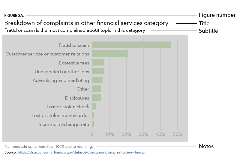
Titles
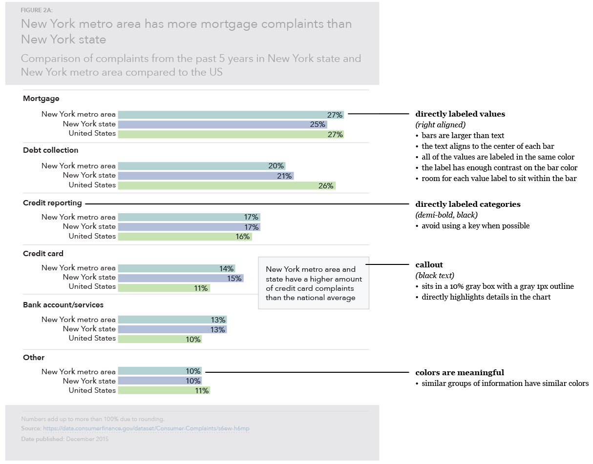
Titles should be as descriptive as possible to give users a sense of what the chart will be about. This not only provides users a framework of what they are looking at, but also helps with 508 accessibility and decreases the amount of text necessary in alt tags.
Labels and keys
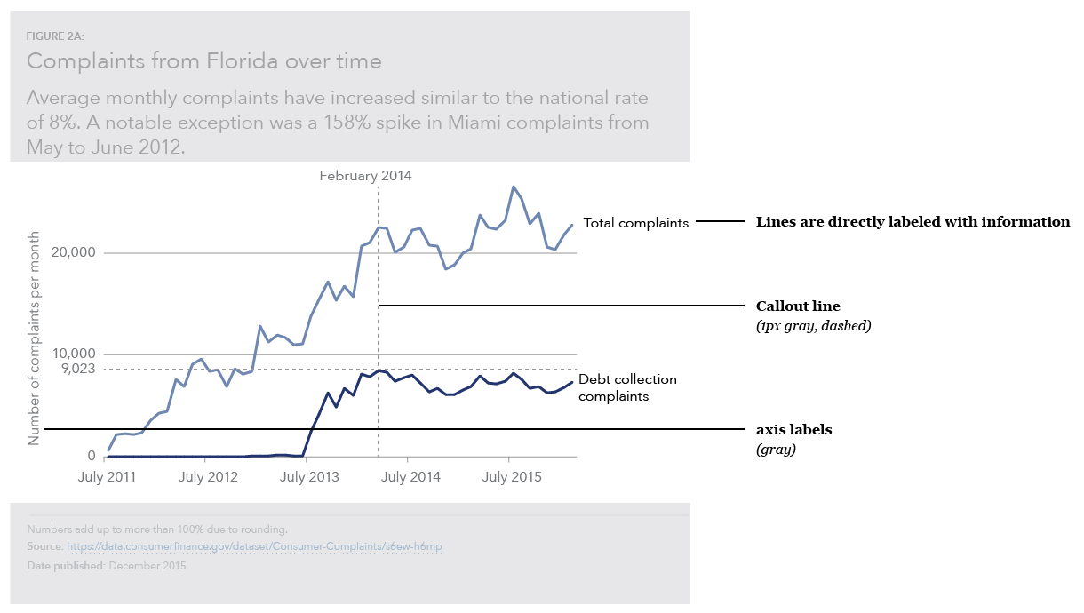
Wherever possible, charts should not include a key, and data should be directly labeled. This reduces the cognitive burden for the user so they are not hunting for labels and trying to connect colors to the data.
Standard visualizations
All variations use these base styles and guidelines unless otherwise noted.
Title
- Gives an overview of what the graph is about
- Uses the
h3heading style - 2 lines of text maximum
Subtitle
- Explains the general trends of the graph and what that means, including why it is important
- Uses the
body textparagraph style - 3 lines of text maximum
Notes
- Describes any caveats or inconsistencies with the data such as explaining why numbers do not add up to 100% or the specific dates that the data is pulled from
Data source information
- Provides a link to the URL of a spreadsheet or to the source of the data
- Important to include for trustworthiness and validity
- Allows people to dive deeper into the data and explore the nuances for themselves or to replicate the visualization
Reports
Figure number
- Uses the
Figure numberstyle (all caps)
Web pages
Generally presented as interactive visualizations rather than static images.
Figure number
- Uses the
H5heading style
Blog posts
Uses standard styles, no figure number.
Social media
CFPB logo
- Include the CFPB logo; helps with identification and determining origin if the graphic gets re-used
Color
When used properly, color can help clarify relationships between data, provide emphasis for certain data points, and maintain a consistent brand voice. When used poorly, color can overwhelm the user, make the data confusing and break with brand standards to appear inconsistent.
Key questions
- Does the use of color have a purpose?
- Have you relied on more than just color to connote meaning?
- Have you accounted for color blindness?
Color palettes and accessibility
We use specific color combinations to create accessible, on-brand data visualizations. View our data visualization color palettes.
We also have a set of guidelines around the accessible use of color in both web and print. View color accessibility guidelines .
Emphasis
Highlighting parts of your chart will help users quickly understand the point of the graphic and accurately comprehend the information.
Key questions
- What is the point of the chart?
- Can someone who hasn’t seen the chart before figure out the point from a quick look and the title?
Visual hierarchy
Good visual hierarchy allows the user to focus on the most important piece of content first and work their way into the graphic. The title and subtitle should be the first thing that the user reads when viewing the chart to give them context of what the chart is about. Therefore, they should be the biggest thing on the chart (see the Data visualization chart components section).
Use the squint test (take a step back from your graph, squint your eyes, and say what you see first, second, third…) to get a sense of what your users will automatically identify first.
Labels
Goals, trends, and important outliers should be highlighted to help the user discern what is going on with the data. Labels will help the user understand the data and make sense of what it is showing.
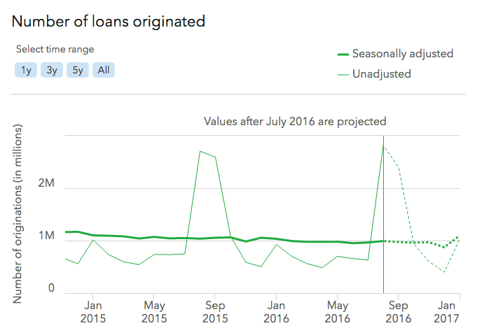
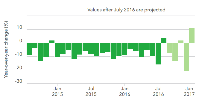
Projected values
When dealing with projected or predicted data, the predicted data should be deemphasized. Use a color change to a lighter tint or dashed outline for bar charts, a dotted line for line charts, and a label explaining what part of the data is predicted or projected.